

MADISON YOUTH SOCCER CLUB
LOGO/BRAND DESIGN
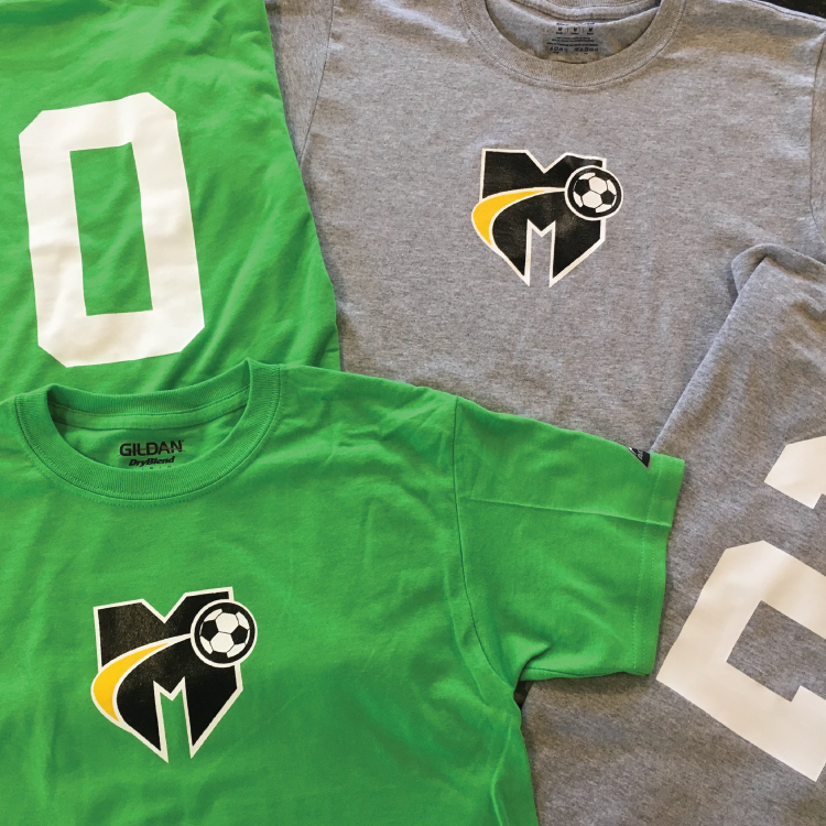
The Madison Youth Soccer Club reached out to Gulla Design to create a unique identity that was a departure from their past logos. Working closely with Matt Starkey, the MYSC Co-President, we felt that focusing on the simplicity and boldness of the letter 'M' would be a welcome departure from past crests and a tiger, which was more of an identifier with the high school than with youth soccer. We designed a logo that indicates stability and style, as well as movement. The logo is also extremely versatile and adaptable for uniforms and merchandising, which was an important requirement of the logo.
< BACK


