

COLUMBIA UNIVERSITY
LOGO/WEB/PRINT DESIGN
Gulla Design was approached to create an identity and print materials for the Continuing Education Department of Columbia University. The initial phase was to design the logo. The client was interested in a fun symbol that would help to bring more people into their Continuing Education classes. The logo was created by drawing the letters C and E and then flipping the C horizontally to finish the body of an abstract figure. I then added a circle on the top and the logo was complete.
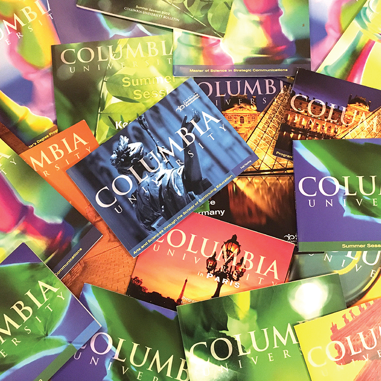
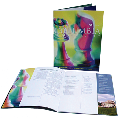
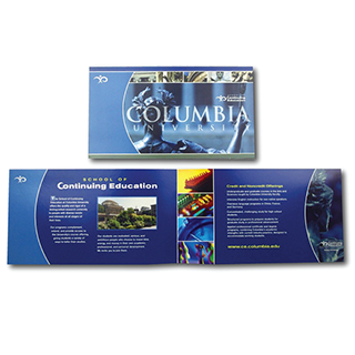
We were then asked to design the overall look and feel of the promotional print materials. The materials included posters, brochures, stationery, press kits, signage and course catalogs. Colorful, moody photography was used as the main element of the posters and course catalogs.


